All the evaluations for the module for the work that I have done this year.

Friday 22 May 2015
Wednesday 20 May 2015
Time Management for Second Semester
For the second semester, me and Emily decided to record the time that we had on an A3 calendar so as to keep a track of what needed to be done and manage our time effectively just like we had done for the first semester as it was an effective way of keeping track of time.
As the semester went on, I continued to add new things that would happen onto the calendar and record the times I would be working on the weekend so I could see if I had a chance to do some work over the weekend. I felt that being able to see when I had booked things made for a visual diary and time frame to work to.
 |
| Calendar for Second Semester Time Management |
Saturday 16 May 2015
OUGD603 Set Brief: Design Publication Brief
As part of the module requirements, we need to produce a design publication to present our methodology of working, in conjunction with the Ditto Press Workshops we had earlier in the year. However, as previously documented, I had struggled with even understanding what was going on during that session. Therefore, when we were briefed for this publication, we were told just to document our method of working.
I began by writing out the brief for the project so I had a clear focus on what I was trying to achieve for the publication. From the confusion that I had been having previously from it, it was necessary for me to be able to understand the needs of the publication.
In the first one, I was told that all of the ideas that I had were very good yet I was still undecided as to how I would pull off any of the ideas. In the second one, the discussion led to me working towards a cook book about how I work as I realised during that crit that aspects of my personality reflect my design style, how I work and the work that I choose to produce.
I thought the idea of doing a cookbook was a great idea as it gave a contextualised manner to which I would be able to present my methodology, which exactly reflects my design work because I love having a strong concept to all my projects. Following on from this, I began to plan what pages and elements I could put into my book. I decided to split up aspects of my personality as me as a person and me as a designer which would both come under 'ingredients'. In regards to my own work and approach, I decided that I would present them as 'recipes' for the design cookbook. I had considered having different stages as a recipe, such as 'how to pick a typeface' for example, yet I soon realised that it would be a very large book which would be reflecting any of the work that I have produced using my method. Therefore, I felt it was necessary to narrow this down to a small section where I could talk about a 'process' like in cooking terms and then have a section about the work I have produced in this way to show how it had been applied and how the reader can do the same.
On the plan, I had also began to sketch out a layout for the book. Having been influenced by cookbooks and how they use a lot of narrow columns of information, full bleed images and step by step information, I had decided to follow a similar format with a large image on one side and text on the other.
Layout


All of the pages are very cohesive and work well as a unit, with some very strong imagery to show the work. I am very happy with the way that the work has been presented and allows for a
Taking the format that I established, I applied this to the other pages that were not 'recipes'.


Having worked out the pages for the book, I needed to begin on working on the written content of the book.

I started by writing out the information that I needed for the page. Originally, I decided to have the text in a paragraph but then I tried it by breaking up the information into sections. After comparing the two styles of writing, I felt that by using a step by step instruction, it was much more fitting to the context of the book.


Final Design
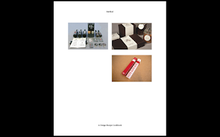
A publication showcasing my design methodology in the context of a design cookbook.
I was really happy with the way that the book came out as the layout and style of the book is the best that I had ever done. I am never happy or satisfied with the way that I work on publications but this is the last chance I've had to produce one and I wanted to do something that I could be proud of and I feel as thought I accomplished that.
I decided that, with the way that the publication was being presented in such a professional way, I wanted to get it printed and bound properly as, when I tend to bind it myself, it always tends to go wrong however much I try and I knew that I wanted the book to be available for actual use. I got the book printed in a perfect bound style


I tried to present the book in a professional way by photographing it in a way that showcased the varying layouts and how I have integrated my work.
Overall, I am very pleased with the way that the brief has turned out as it has become a very strong project that I have done this year. I feel as thought I have managed to take the opportunity to confront and overcome the fear that I had over layout and editorial and prove to myself that I can work just as well as others on it. I am happy that I was able to produce the design publication to a concept so that there was a focus and specific way of accessing the content. If I was to try and improve the brief, I would maybe include other briefs that I had done which maybe weren't as successful so you could see how not following a personal methodology can effect the design outcome.
 |
| Written Brief for Design Publication |
 |
| Initial Idea Brainstorm |
The first thing I did was begin to brainstorm concepts and ideas that I could apply to the way that I work.
The work that I produce is very heavy on branding so I knew that I would have to include that within the publication somewhere. I thought about producing some brand guidelines about myself but I thought that would be incredibly difficult in regards to content. I thought about perhaps making a storybook similar to that of my YCN submission where I took the reader on a journey with a character who was designing a brand. Another idea was to make a book which was interactive that got the reader involved in following my method through the book so by the end of it, they had made a brand of their own. Despite all of these ideas, I didn't feel very confident about them and felt that the content would be difficult to produce.
At this point, I had two crits, one after the other, where I described the ideas that I had for the brief (See Extended Practice Blog).
 |
| Notes from the Crits |
 |
| Cookbook Content and Layout Plan |
On the plan, I had also began to sketch out a layout for the book. Having been influenced by cookbooks and how they use a lot of narrow columns of information, full bleed images and step by step information, I had decided to follow a similar format with a large image on one side and text on the other.
Layout
Before I started doing anything else for the book, I knew that I would have to establish a layout for it. This was perhaps one of the more worrying aspects for me on a personal level as layout has been something that I have struggled with throughout my design career so far, however, I wanted to make a book that i could be proud of before I left college so I was determined to make this the best book I could design.
Influenced by the layout sketches I had done for the book plan, I began to work on making a layout for the content. I decided to go for a size of 150 x 180mm because I liked the idea of this design cookbook being something that a designer would be able to have on their desk so I wanted it to be pocket-sized so it wouldn't take up a lot of room and could be like a handbook.


 |
| General Layout Development |
I began by playing with the initial layout I had sketched before moving onto making the layout more sophisticated by working with a large amount of space and making use of it. I usually don't have white space on any layout that I made so the fact that the boxes for content were spaced with room for large margins was strange for me. I got to the point of having pages that reflected each other in regards to content placement, which made for a nice balance. I decided that I wanted to give the impression of being a serious and considered publication so I made space to have the page numbers on each page in the middle with the name of the book and the name of the section of the book on either side to give the reader orientation.
I was very happy with the general layout that I had created as this would work for all pages in the book and gave a great impression for the audience.
With how well the general layout was looking, I moved onto trying to apply some content into the page.


 |
| Content Planning for General Layout |
I began to add written content to the page by writing in the book information into the applicable sections. Following this, I began to split up the page written information into the text box. I decided that for each 'recipe', I would have the name of the brief and a little description underneath the title before you got to the text about the brief which would make for a focused article within the publication. I change the idea of a description to become the 'ingredients' that I used for that brief so that the information would be reflective throughout the whole book. I decided on having two even columns of text about the recipe as that was the amount that fitted in exactly as well as justifying the text to make the publication neater. At the end, I added an image of the project so that I could see if the layout would work. I was very happy with the way that the work was being presented in this fashion as it was classy and exacting and the connection between the double spread pages flowed well.
Despite how much I liked the layout, i felt that having just one image of a brief was very minimal and I wanted to show more of my briefs than just one image. Moving on from this, I decided to make a second double page spread for each brief which would have just imagery on it, just like how a cookbook would have just imagery over some spreads.


 |
| Recipe Image Double Spread Layout |
Using the original general layout as a guideline, I began to play with the space available on the pages and how I should present the images. I realised that a lot of my work tends to be photographed in a landscape format which influenced the way that I could layout the images on the page to show them in the best light. I felt that the best layout overall was the most simple so I just went for two smaller images mirrored alongside one big one like normal to show a correlation between the pages. Also, I left room to have a small column on the side of the pictures to be able to have a piece of information about the images on the page. This reflects the cookbook concept as many images in cookbooks tend to have a small description of what is going on in the image. I felt that this layout allowed for a connection between the images and kept it very simple and clean which aided the seriousness of the content of the book.
Having decided on a layout for the content of the book, I knew that I would have to have a way of separating the three set sections of the cookbook. Many cookbooks have divider pages which split up the content so I felt that this would be appropriate for the way that I split up the content of my book.


 |
| Divider Pages for Book Sections |
I settled on the fact that I had used a lot of white space on the content pages so I knew that I would have even more on the divider pages. I felt that it was relevant to have just text on this page as there was no reason to have an image so I decided to keep it to solely the name of the section on one side. At this point, I realised that I hadn't included any contents pages yet so I felt that this would be a relevant place to have one, listing the pages that would be involved in that section. I listed the briefs that I had completed fully so far this year that were substantial alongside two briefs from last yea which I felt were where I had started to develop my method and approach.


 |
| Chosen Layout Presentation |
These are the layouts I have produced when working together. I am very happy with the way that they have come out and work together as they have a very distinctive presentation style, with the use of the empty space putting emphasis on the content and allowing it to breathe, rather than cluttering it with unnecessary information. I am very happy with this and I aim to continue on within the same vein.
To do this, I applied this layout to the rest of the 'recipe' projects that I decided to include within the cookbook publication.


 |
| 'Recipe' Pages with Layout Applied |
Taking the format that I established, I applied this to the other pages that were not 'recipes'.


|
| Non- 'Recipe' Page Layouts |
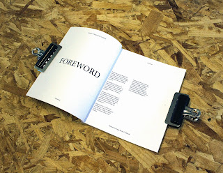
I realised that many cookbooks have an introduction and a final word page where the author talks about the reasons for the book and what they hope the reader got out of it, therefore, I decided to include a foreward and an afterward. I made a divider page for the 'ingredients' and 'method' section, as well as splitting up the 'method' section into concepts, development and production.
I was really happy with the way that the layout of the cookbook has come along and how focused the content of the book is, especially the way that I am able to present the work in a professional manner in this way.
Having worked out the pages for the book, I needed to begin on working on the written content of the book.

 |
| Presentation of Written Content |


 |
| Image without Context Paragraph |
I applied the step by step presentation of information to the written content, however, I didn't think that the image caption was fitting with the layout of the page so I decided to get rid of it as I thought it might have been a distraction to the rest of the information.
I wrote out all of the necessary information for each page, reflecting the step by step style that I had been working on.
The content of the book I have written as original information for the book. The 'ingredients' section was a list of things that are aspects of my personality and as a designer and a small explanation as to why its relevant to my design. I felt that this was a strong element of my methodology and makes sense to have this included throughout the book as it helps to understand the way I approach design. The 'method' section of the cookbook was split up into the step by step instructions which would allow for another designer to get involved with. The 'recipe' section is written in a way that explains how my 'recipe' of personality is involved in the design and shows how the 'method' was used to produce the work.
At this point, now I had the text in my cookbook, I hadn't actually considered the typeface that I had been using as I had been so caught up working on the layout of the book and getting it right.


 |
| Font Experimentation |
I decided to try the book with a range of different fonts, working with sans serif to give the cookbook a modern feel, working alongside the clean aesthetic of the layout. Despite this, whatever fonts I tried it just didn't look right compared to 'Minion Pro', which gave a clear and classier visual to the content of the page.
From the inside content, I moved onto trying to make a front cover.


 |
| Initial Book Cover Attempt |
I began to try and come up with a front cover for the book whilst following the grid for the book. I thought that it would be nice to have an image of each of the recipes on the front cover but, as I was adding the images, the layout was just not fitting at all and didn't reflect the way that the cookbook was being reflected. I decided that it would be more relevant to have just one large image on the front cover so that it would be like the double spreads in the book. I felt that this was much better as it worked with the content inside. With this, I put the title of the book in the same place as the book information within the pages.
Another thing that I had decided on was the name of the book. I wanted something that was relevant to cooking as well as the design process. With that, I felt that the most relevant name that I could give the book would be the word 'Method' as this is exactly what connects both processes. With that, I will have to change the 'method' section of the book to the word 'process' so that it still can be a section about my methodology.
The next thing I needed to consider was the imagery that I was going to use for the non- recipe pages.

 |
| Images for 'Ingredients' page |
For the Ingredients page, I wanted to have images of work that reflected the attributes of what the page was saying. I felt the YCN book reflected my personality, with the fun and light-hearted nature of the visual illustrations, so I included it for the 'as a person' section whereas I felt the Zephyr project reflected many attributes of the 'as a designer' section, with the brand theory and audience consideration, so there were the most appropriate way of illustrating these attributes.


 |
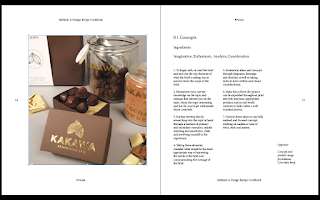
| Images for 'Processes' Section |
For the Processes page, I wanted to have images of work that reflected the attributes of what the page was saying. I felt the Kakawa brand reflected the use of a strong concept so I included it for the 'concept' section whereas I felt the Swell project reflected the 'development' of a brand, with the brand theory and audience consideration alongside the National Trust brief showing contextual relevance and context which reflected the 'production' section, so there were the most appropriate way of illustrating these attributes.
However, having these images on the page meant that I needed to contextualise the reason as to why they were there for the reader so that meant that I needed to add a image caption back into the book.
I decided to see whether the content of the book worked with the front cover I had designed alongside the image decisions.
I was really happy with the way that the imagery was going and surprisingly the use of a caption for the images made a lot of sense. Another thing I had included within the book was the information for the inside and outside pages. I had the title in the middle with the author name and context of the book in the top and bottom margins. I decided to have a disclaimer at the back of the book stating that the images are all my own as a lot of proper cookbooks would have a copyright over the image and content used.
I realised that the 'recipes' order in the cookbook didn't actually have any relevance to the order that they had been put in the book so I knew that I needed to change it.
I changed the layout so that the 'recipes' were in a specific order, going in the order of which the projects were complete. This was so that the reader would be able to see the way that my methodology has become more streamlined and improved over the projects that I have done.
Despite this, I just wasn't sure about the front cover. I thought it was a bit out of place to have an image of one of the recipes and I decided that I wanted to save the 'recipe' images for inside the book. I decided that I thought it would be an idea to take inspiration from the divider pages of the book and have just a type- based cover.


 |
| First Pages of Book |
By putting the title of the book in the middle of the page and changing the cover to be a type-based one, it made for a much more succinct cook book. I was much happier with the way that the layout was being presented, however, I felt that the front page needed to be worked on so that it gave a better presentation of the title cover.


 |
| Information Placement Experimentation |
I began by working on the title placement, working with the size of the font and the placement of the title on the page. I worked on the hierarchy of information by making the title of the page the largest piece of information and making the tag line of the book smaller underneath. I preferred the title to be centred as that is naturally where the eye is drawn to as well as being reflective of the layout of information on the divider pages.


 |
| Thickness of Font Experimentation |
I felt that the hierarchy of information needed to be more definitive so I decided to see whether I could add more emphasis. I changed the weight of the font to see whether the title page would suit a thicker weight and I settled on the bold weight as it gave a distinctive and commanding presence, which is needed for a book with instruction.


 |
| Experimenting with Letter Spacing |
After this, I thought it would be nice to play with the letter spacing of the cook book title to give a dramatic emphasis on the wording. I found that the spacing of 100 gave a good balance between some positive space and the placement on the page.
Final Design
A publication showcasing my design methodology in the context of a design cookbook.
I was really happy with the way that the book came out as the layout and style of the book is the best that I had ever done. I am never happy or satisfied with the way that I work on publications but this is the last chance I've had to produce one and I wanted to do something that I could be proud of and I feel as thought I accomplished that.
I decided that, with the way that the publication was being presented in such a professional way, I wanted to get it printed and bound properly as, when I tend to bind it myself, it always tends to go wrong however much I try and I knew that I wanted the book to be available for actual use. I got the book printed in a perfect bound style


 |
| Photography of the Cookbook |
With the inclusion of the photographs I had taken, I made some submission boards for the module submission to demonstrate the journey of the brand and how I came to this conclusion.
I feel that the boards that I have produced shows a very condensed yet clear development of how the project progressed.
Subscribe to:
Posts (Atom)